")
")

Search the Blog
Latest Comments
Harma
Blog Break .
29. April 2024
Isn't the selvedge something to worry about in a later stage? It seems to me a lot more important th...
Beatrix
Experiment!
23. April 2024
The video doesn´t work (at least for me). If I click on "activate" or the play-button it just disapp...
Katrin
Spinning Speed Ponderings, Part I.
15. April 2024
As far as I know, some fabrics do get washed before they are sold, and some might not be. But I can'...
Kareina
Spinning Speed Ponderings, Part I.
15. April 2024
I have seen you say few times that "no textile ever is finished before it's been wet and dried again...
Katrin
How on earth did they do it?
27. März 2024
Ah, that's good to know! I might have a look around just out of curiosity.
I've since learned that w...
Choose Wisely!
After being happy about figuring out the setup and sequence for my twill tablet weaving demo for NESAT, using up the last of my playband, I set out to warp a new band. Logically, that band also needs two colours, ones that play well together as in "give good contrast".
Well. Let's say my brain was probably not fully online when I was making the new warp... I looked at the colours, thought "they look nice together", found that the two colours were rather different from each other, then thought for a split second "but they are both rather light..." and then proceeded to warp anyways.
Which was, in retrospective, not a good choice. That quickly became clear when weaving the first few picks.
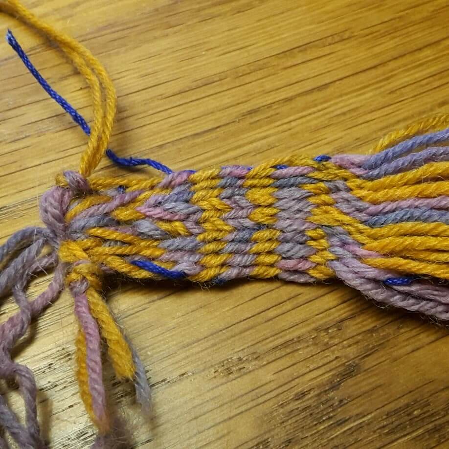
Yes, the two colours do look nice together. Yes, you can see the lines. However, contrast is not very high after all, and high contrast in every imaginable lighting (including not-so-good lighting) would be a very smart thing to have for a demo band.
The reason for the not-so-good contrast is the difference, or better the lack of difference, in the grey value of the colours... which becomes very obvious if you use one of the convenient quick filters that will turn your image into grey-scale or, in this case, because I like it, sepia:
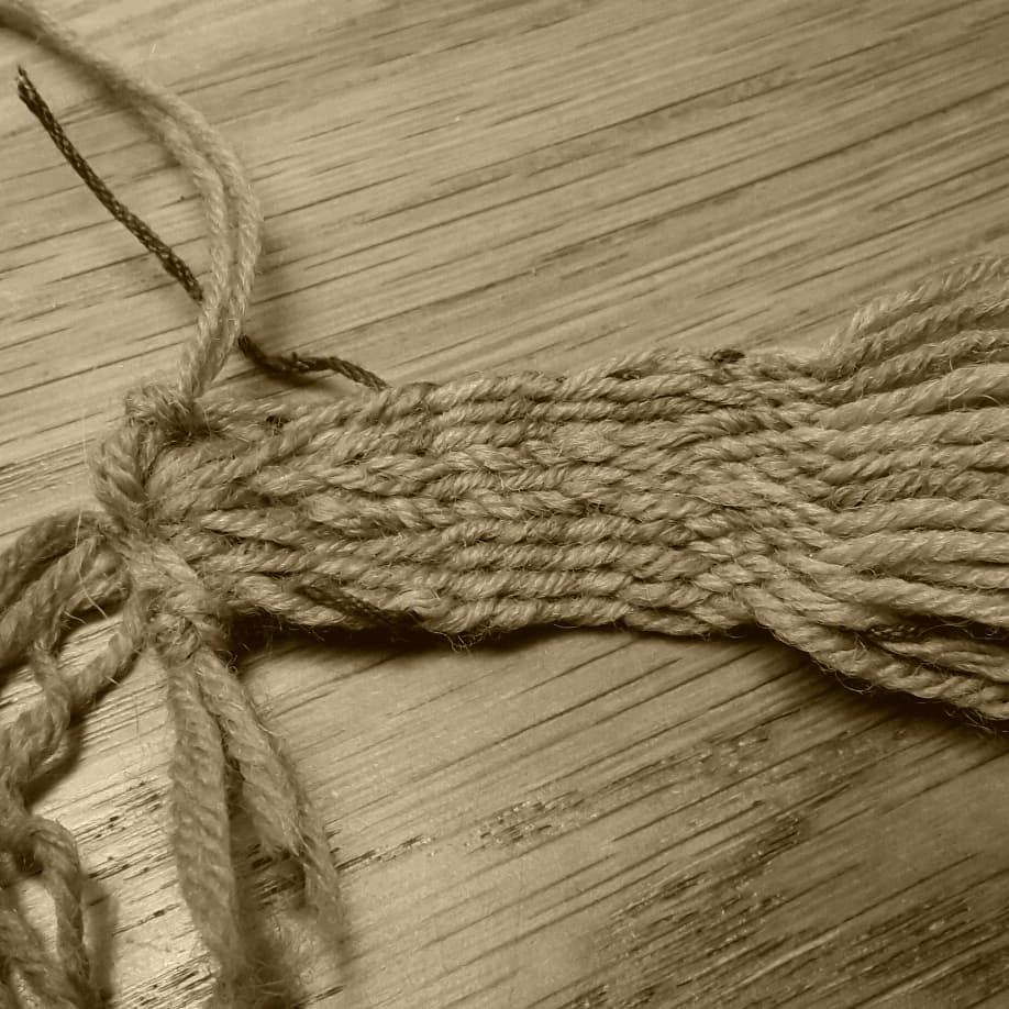
Nice, isn't it? You can see the structure of the band, and you might be able to guess where one or the other colours are, because of teeny tiny differences in darkness - but then that might just be an effect of the slight irregularity of the colours.
So this warp is not what I need for my demo. But. The effect of "everything the same colour" is just what you get in so, so many cases of archaeological textile finds - which, of course, includes tablet weaves. In these bands, there's sometimes a hint of pattern weaving because of changes in twist direction in the band.
I've had this idea of trying out how a band with a few different pattern types would look if everything turned the same colour for a while now, and this oopsie warp now means I have something to do exactly that. It's just 10 tablets, and not very long, so it will not result in spectacular stuff, but I'm planning to do some "threaded-in patterns" using tablet threading direction and alignment, a bit of "4 forward, 4 back" patterning, and then some Egyptian Diagonals and twilly stuff to round things off. Make photos of the band in colour, turn them into sepia, and see.
I think this sounds like fun - it just remains to see when I'll find the time for said fun, as there is still the "real" NESAT demo prep work to do. (Also there's a queue of fun stuff waiting for their turn... which, yes, is a luxury problem.)
Well. Let's say my brain was probably not fully online when I was making the new warp... I looked at the colours, thought "they look nice together", found that the two colours were rather different from each other, then thought for a split second "but they are both rather light..." and then proceeded to warp anyways.
Which was, in retrospective, not a good choice. That quickly became clear when weaving the first few picks.
Yes, the two colours do look nice together. Yes, you can see the lines. However, contrast is not very high after all, and high contrast in every imaginable lighting (including not-so-good lighting) would be a very smart thing to have for a demo band.
The reason for the not-so-good contrast is the difference, or better the lack of difference, in the grey value of the colours... which becomes very obvious if you use one of the convenient quick filters that will turn your image into grey-scale or, in this case, because I like it, sepia:
Nice, isn't it? You can see the structure of the band, and you might be able to guess where one or the other colours are, because of teeny tiny differences in darkness - but then that might just be an effect of the slight irregularity of the colours.
So this warp is not what I need for my demo. But. The effect of "everything the same colour" is just what you get in so, so many cases of archaeological textile finds - which, of course, includes tablet weaves. In these bands, there's sometimes a hint of pattern weaving because of changes in twist direction in the band.
I've had this idea of trying out how a band with a few different pattern types would look if everything turned the same colour for a while now, and this oopsie warp now means I have something to do exactly that. It's just 10 tablets, and not very long, so it will not result in spectacular stuff, but I'm planning to do some "threaded-in patterns" using tablet threading direction and alignment, a bit of "4 forward, 4 back" patterning, and then some Egyptian Diagonals and twilly stuff to round things off. Make photos of the band in colour, turn them into sepia, and see.
I think this sounds like fun - it just remains to see when I'll find the time for said fun, as there is still the "real" NESAT demo prep work to do. (Also there's a queue of fun stuff waiting for their turn... which, yes, is a luxury problem.)
Comments
No comments made yet. Be the first to submit a comment